
Journal / Bilingual
Under the Haik.
An independent journal in English and French.
Personal publishing projectA CLOSER LOOK
On a laptop. On a phone.
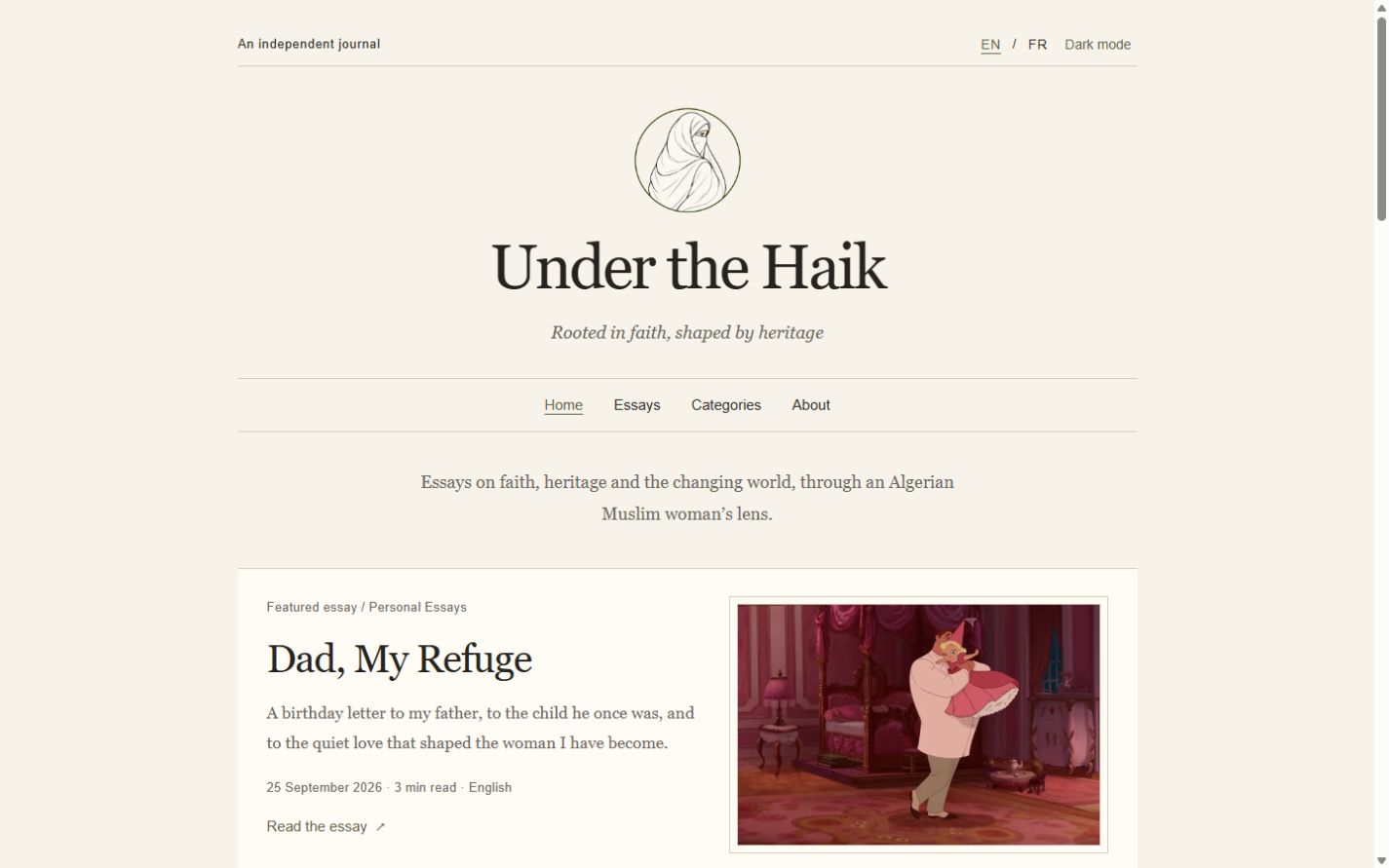
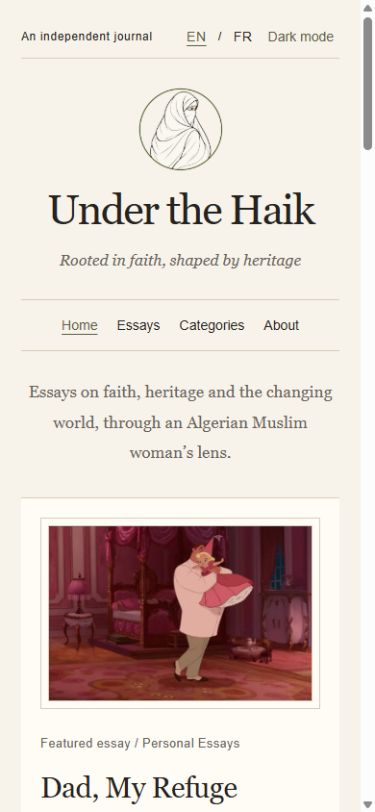
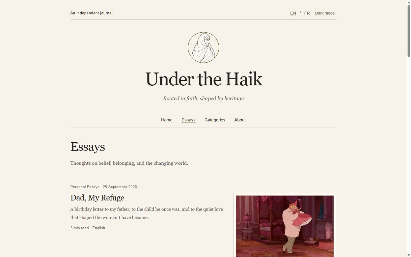
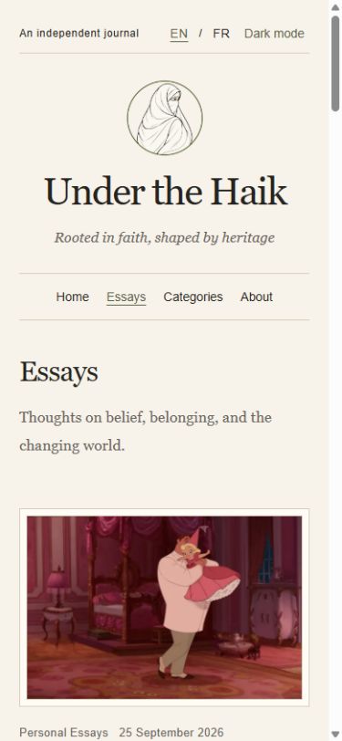
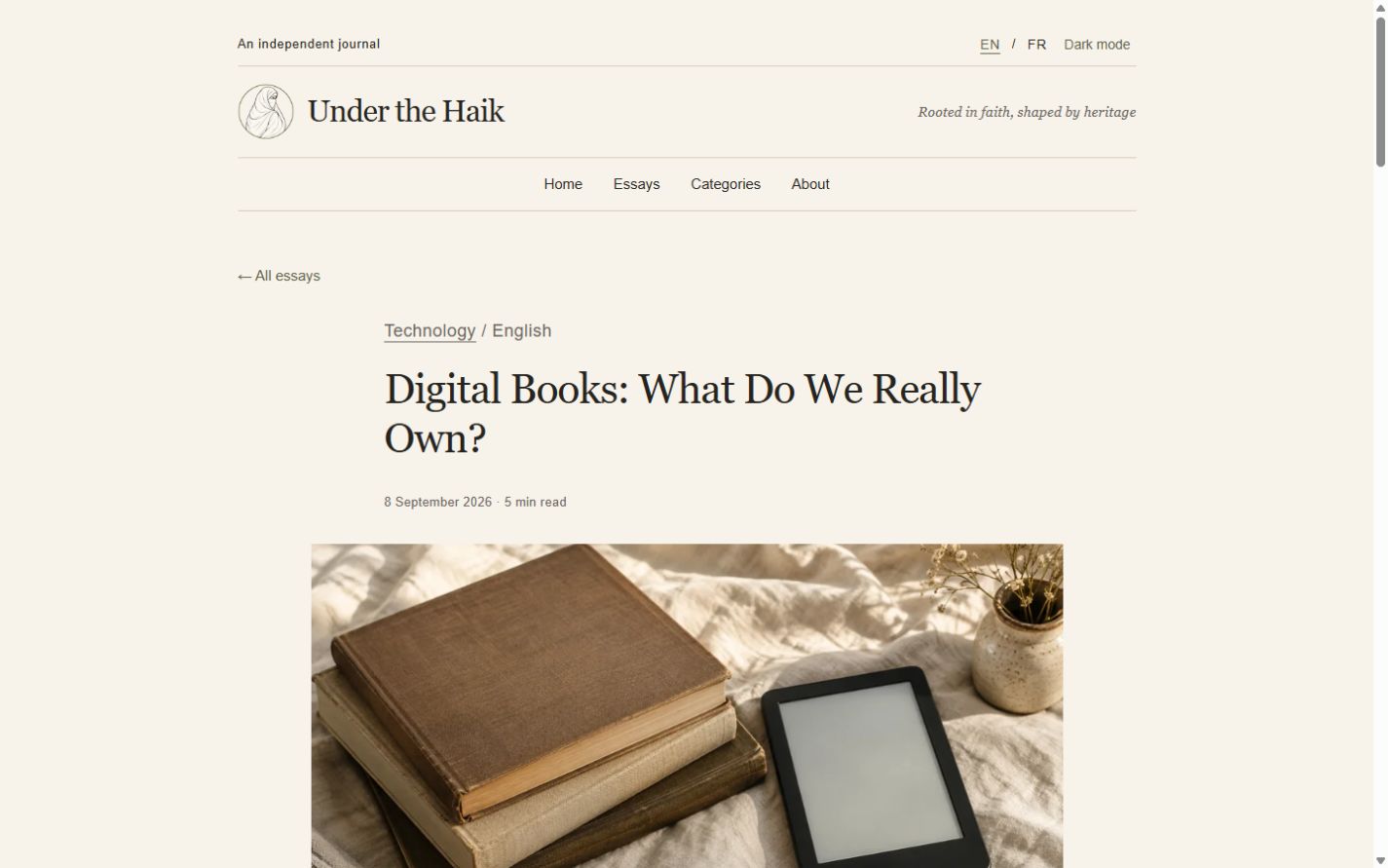
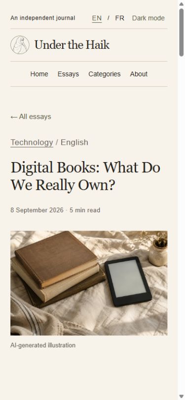
Real screenshots of the published website at laptop and phone sizes. Labels show the original image dimensions. Select a screenshot to view it at full size.
Homepage
Essay archive
Individual essay
01 / BRANDING
The look & feel.
A book-like publishing identity. A serif masthead, paper backgrounds and restrained olive accents keep the writing at the centre.
Personal publishing project.
02 / COLOUR THEME
A palette with purpose.
Paper
#F7F3EA
Ink
#25231F
Olive
#596044
Gold
#A47C3C
Colours taken from the website’s styles.
03 / TYPOGRAPHY
Character & clarity.
Under the Haik
Aa Bb Cc · 0123456789
Simple, readable supporting text gives the name room to stand out.
The website uses Georgia with Arial.
04 / LOGO APPROACHES
One identity.
Different settings.
Wordmark studies adapted from the website identity for light and dark backgrounds, shown in the brand’s heading typography.